Junostarpro Docs
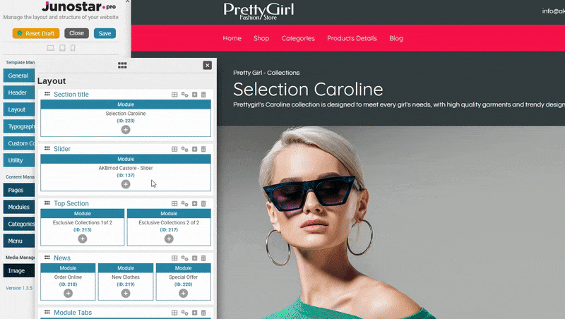
Layout Panel
The Layout Panel of JunostarPro allows you to build, organize, and customize the page structure of your site through a user-friendly visual interface.
You can add sections, define the column layout for each section, insert modules, template positions, or the main component, and configure every visual detail - all without writing code.
All actions can be performed easily using icons and interactive areas: drag, click, select from the modal, or adjust the section’s advanced settings to achieve the layout that best fits your needs.
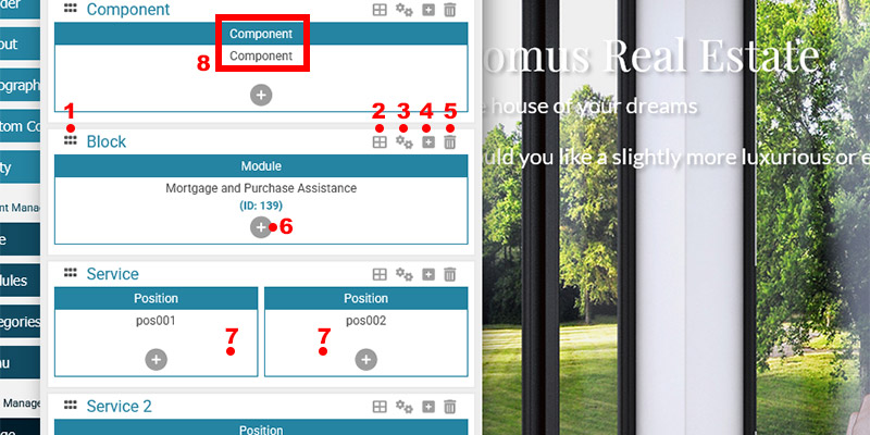
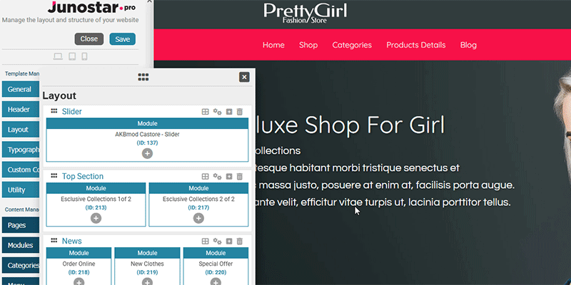
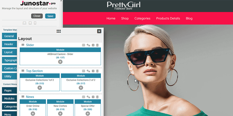
- Section drag handle
Drag the section up or down to change its order on the page. - Set column layout
Click to choose the column arrangement for the section (e.g., 1, 2, or 3 columns, with various proportions). - Configure section
Opens the advanced settings panel for the section (title, margins, padding, colors, background, etc.). - Add new section after
Inserts a new section immediately after the selected one (with one empty column by default). - Delete section
Removes the section from the layout. Confirmation is always required. - Add element to position
Allows you to insert an element (component, module, or position) into the selected column/slot. - Column area
Click and drag here to change the horizontal order of columns within the section. - Element inserted in position
- The blue bar shows the type of element inserted: “Component”, “Module”, or “Position”.
- Below, the specific name is displayed:
- For the component: it will always say “Component”.
- For a module: the module title and its ID are shown (e.g., “Mortgage and Purchase Assistance (ID: 139)”).
- For a position: the position name is shown (e.g., “pos001”).
With JunostarPro, you can easily customize the structure of your page by moving blocks and columns with your mouse, no coding or page reloads required.
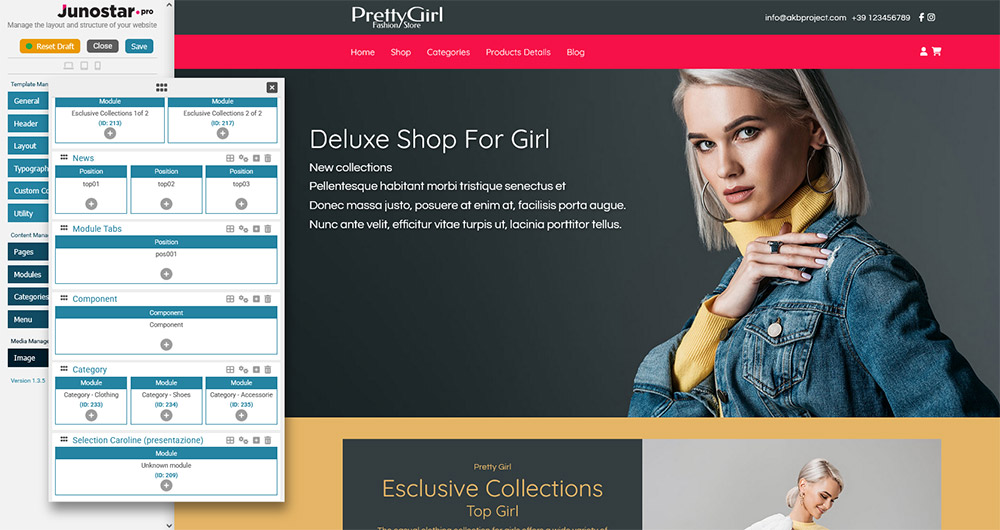
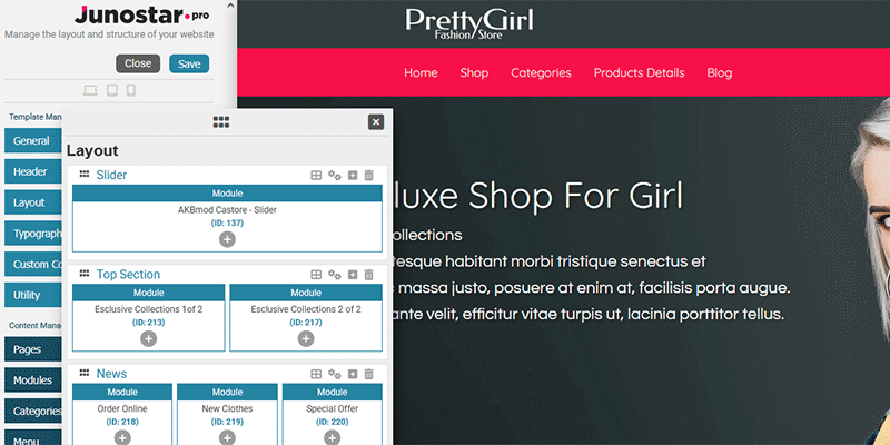
Moving Sections
Each section represents a “block” of your page (for example: header, services, slider, footer). To change the order of the sections, drag the section you want to move up or down using the handle on the left side.
This allows you to easily decide which blocks appear first or later on your page.

Moving Columns
Inside each section, you can have one or more columns (positions). You can also reorder the columns just as easily: click on the column you want to move and drag it left or right to change its horizontal position. This lets you quickly adjust the order of elements within the same block.
Result:
With just a few clicks, you can organize your entire page layout exactly as you want, no technical skills required!
Adding a New Section
To build your page layout, you can add new sections (blocks) using the “Add Section” button.
The new section is inserted immediately after the one you selected and starts with a single empty column.
If you are installing JunostarPro and the template for the first time, the layout will be empty: in this case, a “Create section” button will be displayed, allowing you to easily add the first section of your site.
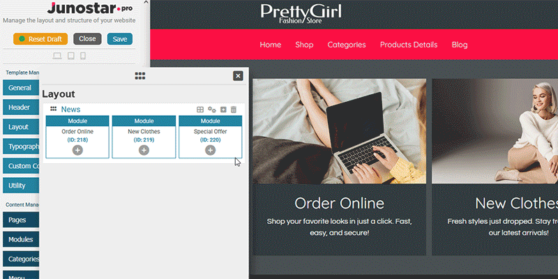
Deleting a Section
You can remove any section from the layout by clicking the trash icon in the section’s bar.
For safety, the system always asks for confirmation before deleting the selected section, to prevent accidental removals.
This operation is reversible as long as you haven’t saved the changes permanently.
No Sections Present: Behavior and Restart
When all sections are deleted (or after a new installation), the layout becomes completely empty.
In this situation:
The “Add section” button is automatically shown in the center of the interface, so you can start over by creating your first section.
Until you add a new section and insert at least one element (module, position, or component), the preview and draft will continue to show the previous (real) data stored in the database.
Only after you insert a new section with at least one element, the draft layout will update and change the preview in real time, even without needing to save definitively.
Permanent saving instead applies your changes for good, making them visible also outside the draft environment.
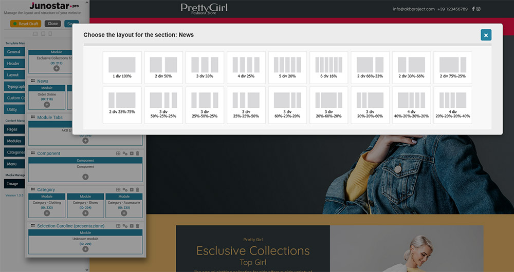
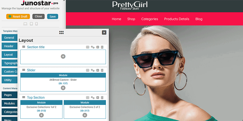
For each section, you can choose how to divide the space into multiple columns, according to your design and content needs.
Click the “Set column layout” icon in the bar of the section you want to modify.
A window like this will open (see image below), where you can view all available layout types: from 1 up to 6 columns, with both symmetrical and asymmetrical distributions.
Select the layout you prefer: the section structure is immediately updated in the preview, ready to be filled with modules, positions, or the main component.
After choosing the column layout, you can populate each column with an element: Component, Module, or Position.
Element Selection Grid
When you click the “+” button inside a column, a window opens showing a well-organized grid of all available elements:
Component:
The main Joomla component (e.g. articles, categories, external components) can be added only once in the entire layout. If it has already been inserted, the button is disabled and a warning message is displayed.
Modules:
Modules are organized by module name: for each module name (e.g. mod_menu, mod_login, mod_custom, etc.), you see a list of all instances of that module (with title and ID). This makes it easy to find and add the right instance, even if you have many modules of the same type.
Positions:
Positions are organized by template: you can view all the positions of each template installed on your site, not just those of the template you are currently working on. This gives you maximum flexibility for advanced layout management, especially when multiple templates are in use.
(See the image below: it shows all selection possibilities, grouped by module name and by template)
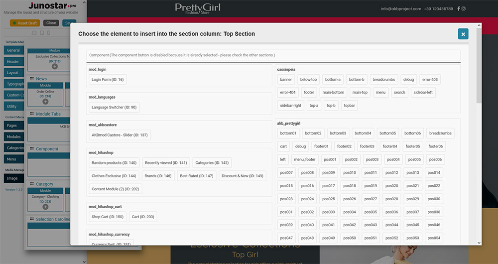
with caption:
Overview of the element selection modal: choose between Component, Modules (organized by name and instance list), and Positions (grouped by template).]
Adding the Component
The main Joomla component can be placed in only one column of the layout.
If you try to insert it a second time, the system shows a warning and the button remains disabled.
Adding a Module
You can add any available module instance to any column, choosing from the list displayed for each module name (menu, login, slider, custom HTML, third-party modules, etc.).
Each module instance is shown with its title and ID for easy identification.

Adding a Position
You can choose any available position to later assign one or more modules to it using the standard Joomla module manager.
Positions are grouped by template: you can view the positions of all templates present on your site, not just the one you’re working on.
Result:
You have maximum flexibility: you can build any layout by combining components, modules, and positions as you prefer, using the smart grouping by module name and by template.
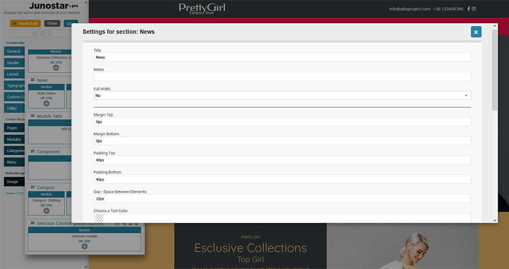
This panel allows you to customize every layout block in detail.
Available options are:
Basic Fields
- Title
The name/label of the section (not visible on the frontend, only for organizing sections in the editor). - Notes
Optional field for inserting notes visible only in the editor (useful for distinguishing sections). - Full Width (yes/no)
Set whether the section should be full width (occupying the entire width of the page) or remain aligned to the main container width.
Spacing
- Margin Top
Distance (in pixels) between the top of the section and the previous block. - Margin Bottom
Distance (in pixels) between the bottom of the section and the next block. - Padding Top
Internal space above the content of the section (in pixels). - Padding Bottom
Internal space below the content of the section (in pixels). - Gap – Space Between Elements
Space (in pixels) between columns/elements inside the same section.
Colors
- Choose a Text Color
Select the main text color for the section. - Choose a Link Color
Color of the links in the section. - Choose a Hover Link Color
Color of the links on mouse hover in the section. - Choose a Background Color
Background color for the section.
Advanced Background Settings
- Background Repeat
How the background image is repeated.
Options:
No: no repeat
Repeat-x: repeat horizontally
Repeat-y: repeat vertically
Yes/Repeat: repeat in both directions - Background Position
Starting position of the background image.
Examples: left-top, center-center, right-bottom, etc. - Background Attachment
How the background image is attached.
Options:
Scroll: background scrolls with the page
Fixed: background stays fixed while the page scrolls
Local: stays attached to the container - Background Size
How the background image is sized.
Options:
Contain: image fits without being cropped
Cover: image covers the entire area
Custom and others: you can specify percentages or custom sizes
Anchor
Set an anchor identifier for the section, useful for creating direct links to this point of the page (e.g., internal navigation).