
Junostarpro Docs
Header Panel
The Header Panel of JunostarPro allows you to fully control and customize the top area of your site. Within this panel, you can choose from several predefined header layouts — each layout automatically arranges elements like the logo, menu, and social icons according to professional ready-made schemes.
In addition to choosing the layout, you can adjust colors, styles, and the display of contact info and social icons, all without manually editing any code.
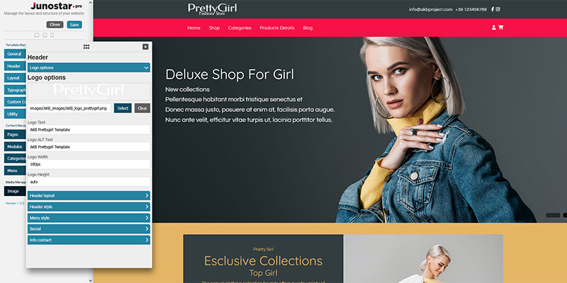
This section allows you to manage all the options related to the logo displayed in your site’s header.
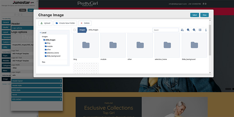
Logo Selection
You can upload or select the logo image using the integrated Media Manager. You can change the logo at any time by choosing a new file, or remove it to use only text instead.
Logo Text
If no image is uploaded, you can enter text that will be displayed instead of the logo image. Useful as a temporary solution or if you prefer a text-based logo.
Alternative Text (alt)
A short description of the logo for accessibility and SEO purposes. Used by screen readers and in search engine results.
Logo Width
Sets the maximum width of the logo (e.g., 120px, 4rem, etc.). Tip: choose a size that keeps the proportions correct within the header.
Logo Height
Sets the maximum height of the logo.
If set to auto (default value), the logo will automatically maintain its proportions based on the width.
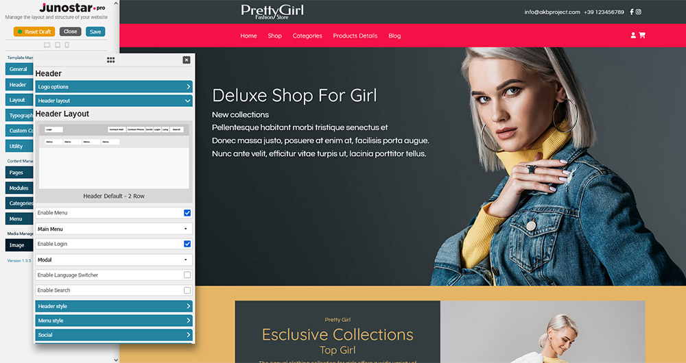
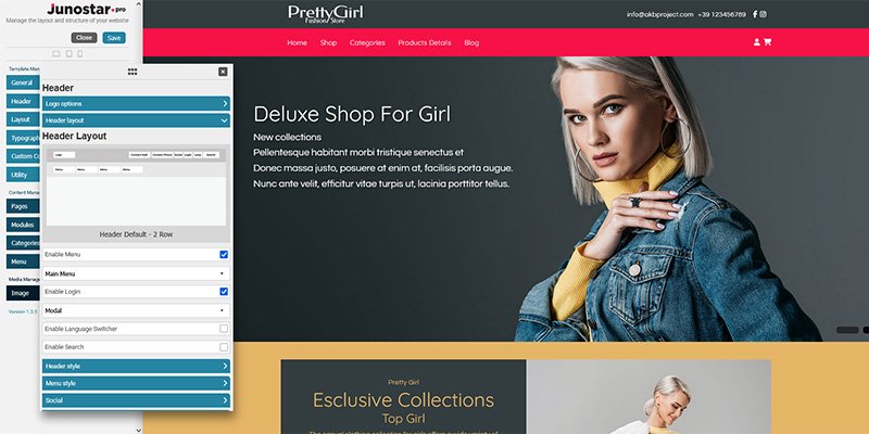
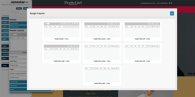
This section allows you to choose the graphic structure and arrangement of the main elements in the header.
Header layout selection
Choose from various predefined header layouts using an interactive modal window. Each layout arranges elements like the logo, menu, and social icons differently (e.g., logo on the left and menu on the right, or logo in the center with menu below, etc.).
You can preview the selected layout directly in the modal before confirming.
Enable menu
Show or hide the main menu in the header.
Menu type
Select which Joomla menu to display in the header (e.g., main-menu or any other menu created by the user).
Enable login
Display the login/user area button or link directly in the header.
Login mode selection
Choose whether clicking the login opens a modal window or redirects the user to the site's standard login page.
Enable language switcher
Show the language switcher for multilingual sites.
Enable search
Add the search icon or search field to the header.
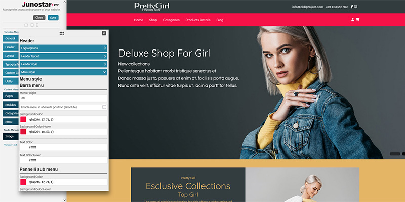
This section allows you to customize the colors and graphic style of the header bar.
Header background color
Choose the background color of the entire header area. Tip: use colors that provide good contrast with text and logos.
Header link/text color
Defines the color of texts and links in the header bar.
Header link/text hover color
Sets the color of texts or links when hovered, providing visual feedback to the user.
Menu Bar
Menu height
Set the height of the main menu bar in the header. Enter a numeric value in pixels (e.g. 60px or 80px).
Enable menu in absolute position
If enabled, the menu is positioned absolutely over the header or hero image.
Enable menu background or keep transparent in initial position
Choose whether to display a colored background behind the menu when the page loads, or keep the menu transparent.
Menu background color
Main background color of the menu bar.
Menu background hover color
Background color of the menu bar or menu items when hovered.
Menu text/link color
Color of the main menu items (text and links).
Menu text/link hover color
Color of the main menu items when hovered (with mouse or touch).
Submenu Panels
This section allows you to customize the colors of the submenu panels, that is, the dropdown panels that appear when a main menu item contains additional dropdown options. For example: If your main menu has an item like Services and, when hovered or clicked, it opens a list of additional options (such as Consulting, Support, etc.), these settings define the appearance of that dropdown panel.
Submenu background color
Background color of the panel that appears with the dropdown items.
Submenu background hover color
Background color of submenu items when they are selected or hovered.
Submenu text color
Text color of submenu items.
Submenu text hover color
Text color of submenu items when they are selected or hovered.
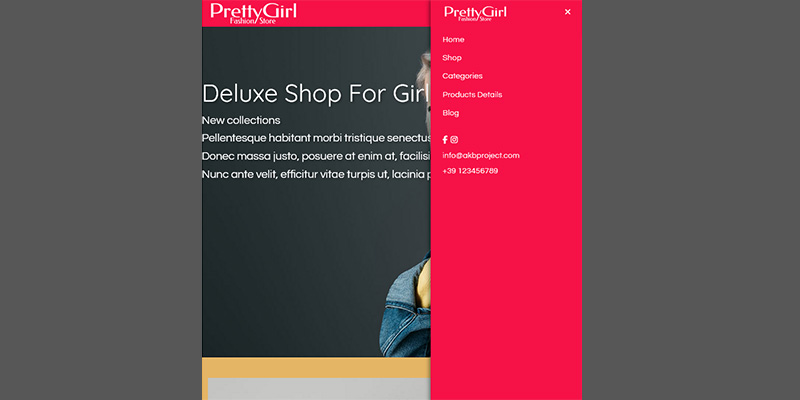
Responsive Menu (Mobile)
This section allows you to configure the appearance of the menu when it is viewed on mobile devices (smartphones and tablets) or when the hamburger menu is active.
Logo
Choose whether to display the logo inside the mobile menu and which version to use.
Background color
Background color of the menu window in the mobile version.
Text/link color
Color of the menu items (text and links) in the mobile menu.
Text/link hover color
Color of the menu items (text and links) in the mobile menu when selected or hovered.
This section allows you to manage the display of social icons inside the header.
Enable social
Enable or disable the social icons bar in the header.
Manage social links
You can add links to your main social profiles (such as Facebook, Instagram, X, LinkedIn, YouTube, etc.). The corresponding icons will be automatically displayed in the header.
The order and style of the social icons depend on the template used and the selected header layout options.
This section allows you to display the main contact details of your site in the header.
Enable contact info
Enable or disable the display of contact information in the header.
Phone number
Enter the phone number you want to show at the top. The number will appear as text or as a clickable link (tap-to-call on smartphones).
Email address
Enter the email address to display in the header. It will appear as a mailto link to open the default mail client.
The order, placement, and appearance of contact information depend on the selected header layout and the active template.
