
Junostarpro Docs
General Panel
The General Panel of JunostarPro allows you to configure the basic style and layout aspects of your website. The options are divided into 4 sections: Body, Button, Card, Footer.
Each section provides tools to customize the global appearance of the site, ensuring maximum visual consistency and flexibility.
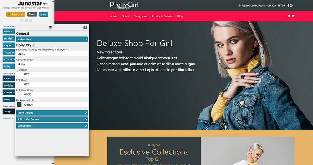
This section controls the overall appearance of the main area of the site and its main containers.
Body Width
Sets the maximum width of the main content area.
Example: You can use values like 1200px or 100% for a fixed or fluid layout.
Container Width
Sets the maximum width of inner content (such as text and modules).
Useful for aligning content and ensuring readability even on very wide screens.
Text Color
Sets the default text color in the body area.
Choose a color that provides good contrast and accessibility.
Link Color
Sets the color of links in the body.
It is recommended to use recognizable colors (e.g. blue for standard links).
Link Hover Color
Changes the color of links on mouse hover.
Useful to highlight interactivity and improve usability.
Background Color
Sets the background color of the main area of the site.
You can use light colors for institutional sites or dark ones for a modern look.
Configures the appearance of the site footer.
Footer Text Color
Color of the text in the footer.
Footer Link Color
Color of links in the footer.
Footer Link Hover Color
Color of links in the footer on mouse hover.
Footer Background Color
Background color of the footer.
Enable Copyright
Show or hide the copyright notice in the footer.
Copyright Text
Custom copyright text.
Copyright Link
Link associated with the copyright text (can point to the site, legal page, etc.).
This section controls the appearance of all default site buttons.
Button Background Color
Main background color of the buttons.
Use colors consistent with your brand identity.
Button Background Hover Color
Background color of the button on mouseover.
It is recommended to use a slightly lighter or darker color for visual feedback.
Button Text Color
Sets the text color of the buttons.
Button Text Hover Color
Sets the text color of the button when hovered.
Note: Some options may be repeated for different button types (e.g. primary, secondary), depending on the template used.
Allows you to manage the appearance of “cards”, the information boxes used in many modern layouts.
Enable Card
Enables or disables the card style for sections that support it.
Card Title Size
Sets the font size of card titles (e.g. 18px, 2rem, etc.).
Card Title Color
Text color for the card title.
Card Title Background Color
Background behind the card title (useful to highlight the title).
Card Text Color
Color of the text inside the card.
Card Background Color
Background color of the card.
Card Padding
Internal spacing of cards, to separate the content from the borders.
Card Border Radius
Sets how rounded the card corners are (e.g. 8px, 1rem, etc.).
